
Case study · Drupal replacement
Hommage.hu: six artist websites, same design, now on mobile too.
The six sites of a Hungarian fine-art portal ran on Drupal 6, unsupported since 2016. We replaced it so that the original look stayed intact on desktop, and the sites finally became readable on phones and tablets.
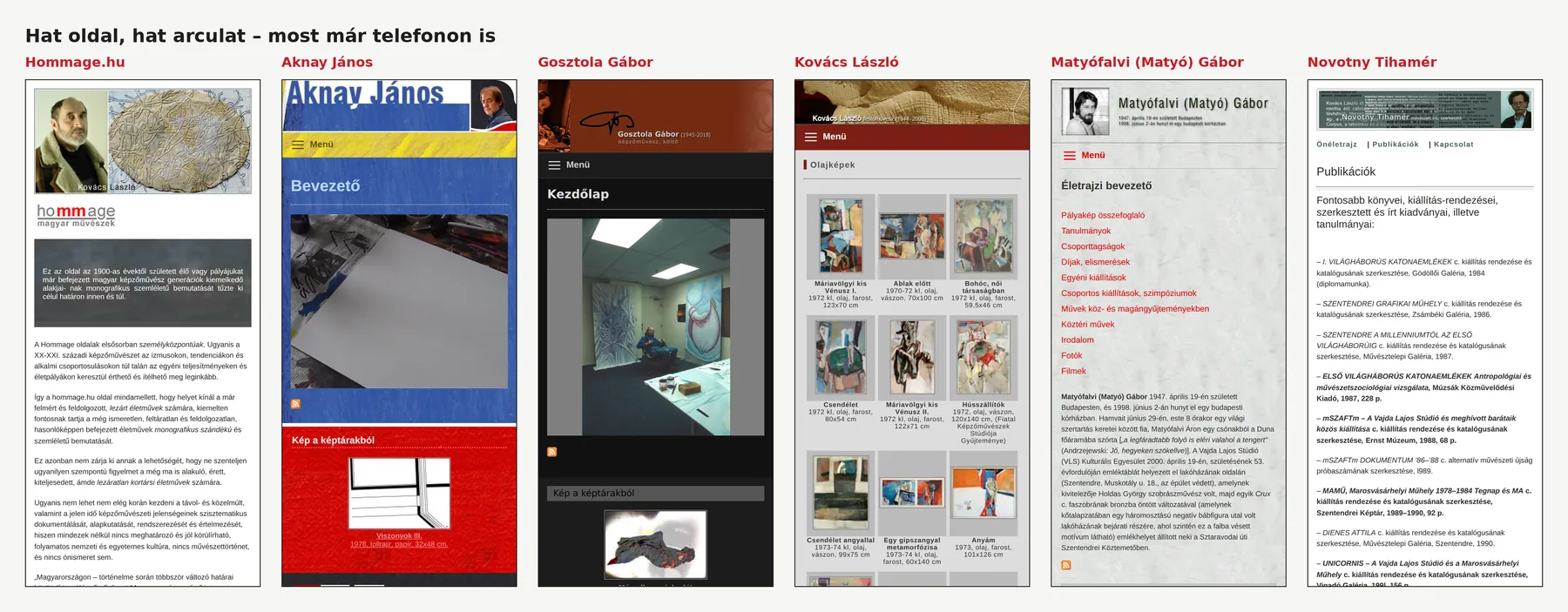
The starting point
A website nobody had dared to touch for years.
Hommage.hu presents the life's work of Hungarian visual artists born from the 1900s onwards, both living and completed oeuvres, with a monographic ambition. Its content is authored by art historian Novotny Tihamér. Under the portal sit five sites: those of Aknay János, Gosztola Gábor, Kovács László and Matyófalvi (Matyó) Gábor, and that of the portal's author, Novotny Tihamér. Each has its own graphic design (on the Matyófalvi site, for instance, menu and content are separated by an element of one of his sculptures: a row of metal clamps binding two stones together), because here the design is part of how the work is presented.
The sites were designed and built from 2009 by our founder, Márton László Attila, then working as eMeLA. More than fifteen years later, that same work had become a liability: all six sites ran on a single Drupal 6 installation on PHP 5.6. Drupal 6 has had no security updates since 2016, PHP 5.6 none since 2018.
- No mobile view: fixed-width layouts of 750–1000 px built on tables, which phones simply shrank.
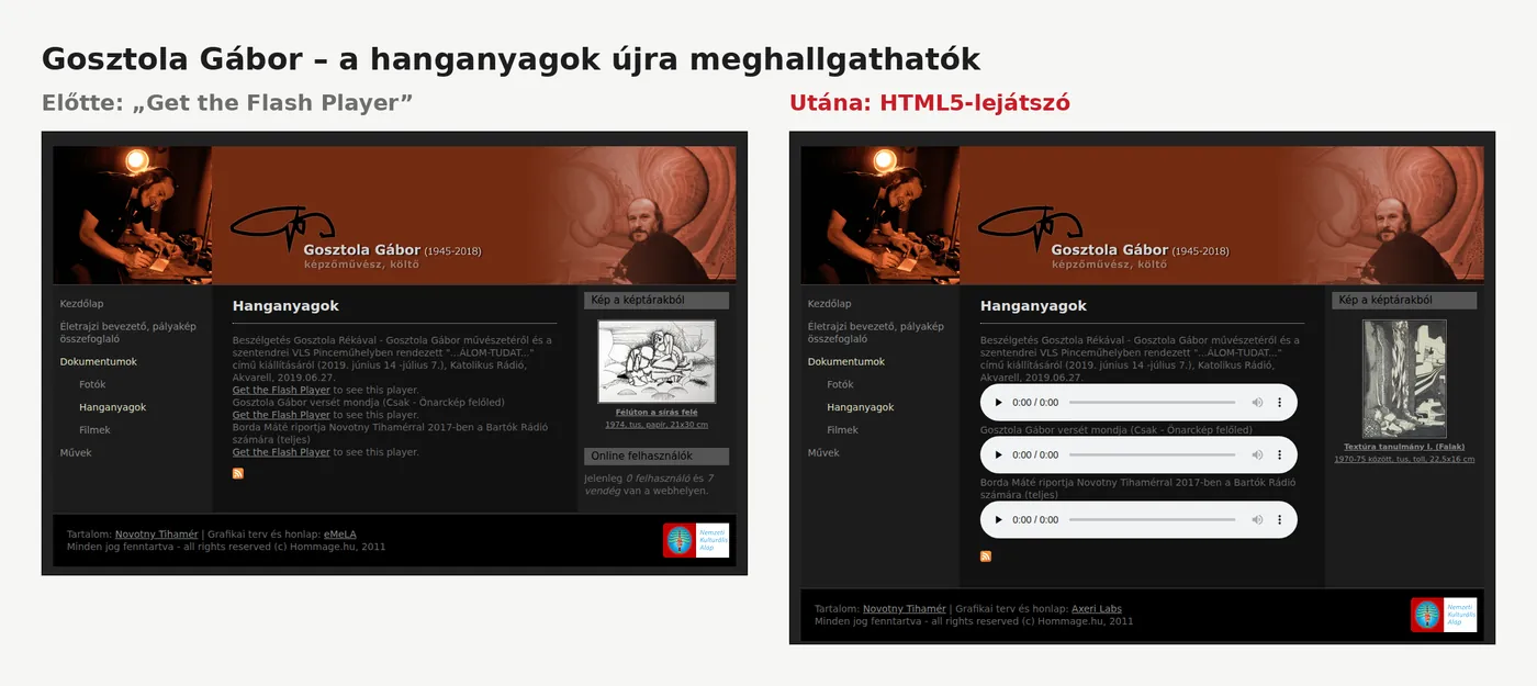
- Audio and video played through Flash. Flash hasn't run in any browser since 2020; visitors only saw “Get the Flash Player”.
- The contact form depended on the old system, several images and links were broken, and the error log had grown to 51 MB.
- And the material isn't small: about 1 GB of files, some 2,600 artwork images, 54 galleries.
The constraints
What had to stay, and what wasn't needed.
The content is closed and archival, so no editing interface is needed. That opened up the simplest and safest route: a fully static site.
The solution
Not rebuilt but rescued, with a mobile layer on top.
The assessment outlined three options: a quick mirror, a rebuild in the old design, or a new unified design. The implementation took a fourth route, combining the simplicity of a mirror with the quality of a rebuild.
- 01
Reviving the old system locally
From a backup of the live database and the files, the complete old environment was started on an isolated local machine. The original site came up exactly as it ran live, without touching the production server.
- 02
Automated static export
A custom exporter crawled all six sites, saved every page as a standalone HTML file, rewrote addresses into clean form (/?q=hu/muvek → /muvek/), and copied only the files actually in use.
- 03
A mobile layer on the site, not instead of it
A separate style layer per site that only takes effect below the width of the original layout. On desktop the old stylesheets keep doing the work; tablets and phones get a new layout.
- 04
Replacing dead technologies
HTML5 audio and video players instead of Flash, with old FLV videos converted to MP4. A faithful still of the original animation instead of the Flash intro, and a small standalone script with spam protection behind the contact form.
- 05
Keeping every old address
The old system served the same content under many addresses. A redirect map was generated automatically from the database, so all 11,314 old addresses (search results, external links, bookmarks) still lead to a live page.
- 06
Verified by measurement, not by eye
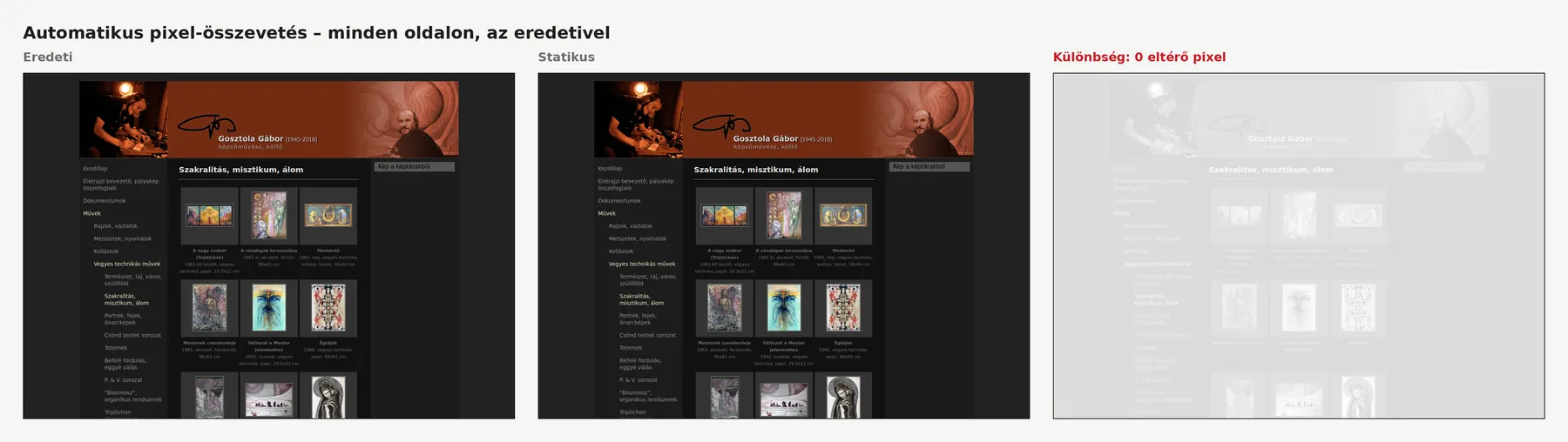
Every page was automatically compared with the locally running original: pixel by pixel, on text, on links and at mobile widths.
The result is a purely static site: no database and no CMS, the only server-side code being the contact form. The old system can be switched off.
Mobile view
A mobile view isn't a scaled-down page, it's a rethink.
Where the graphics didn't fit a small screen, each site got its own solution.
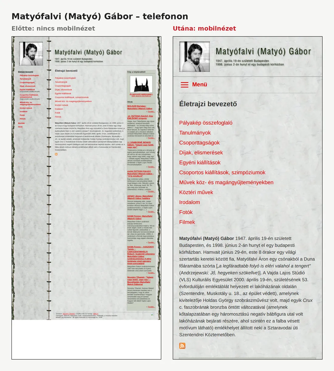
Matyófalvi Gábor
On desktop a vertical row of clamps separates the menu from the content: an element of one of Matyófalvi's sculptures, metal clamps binding two stones together. On a phone it can't serve as a column border. The first version turned it sideways to run horizontally; we rejected that. The final version keeps only the background texture and splits the header: the portrait and the name with the dates sit side by side at a readable size.
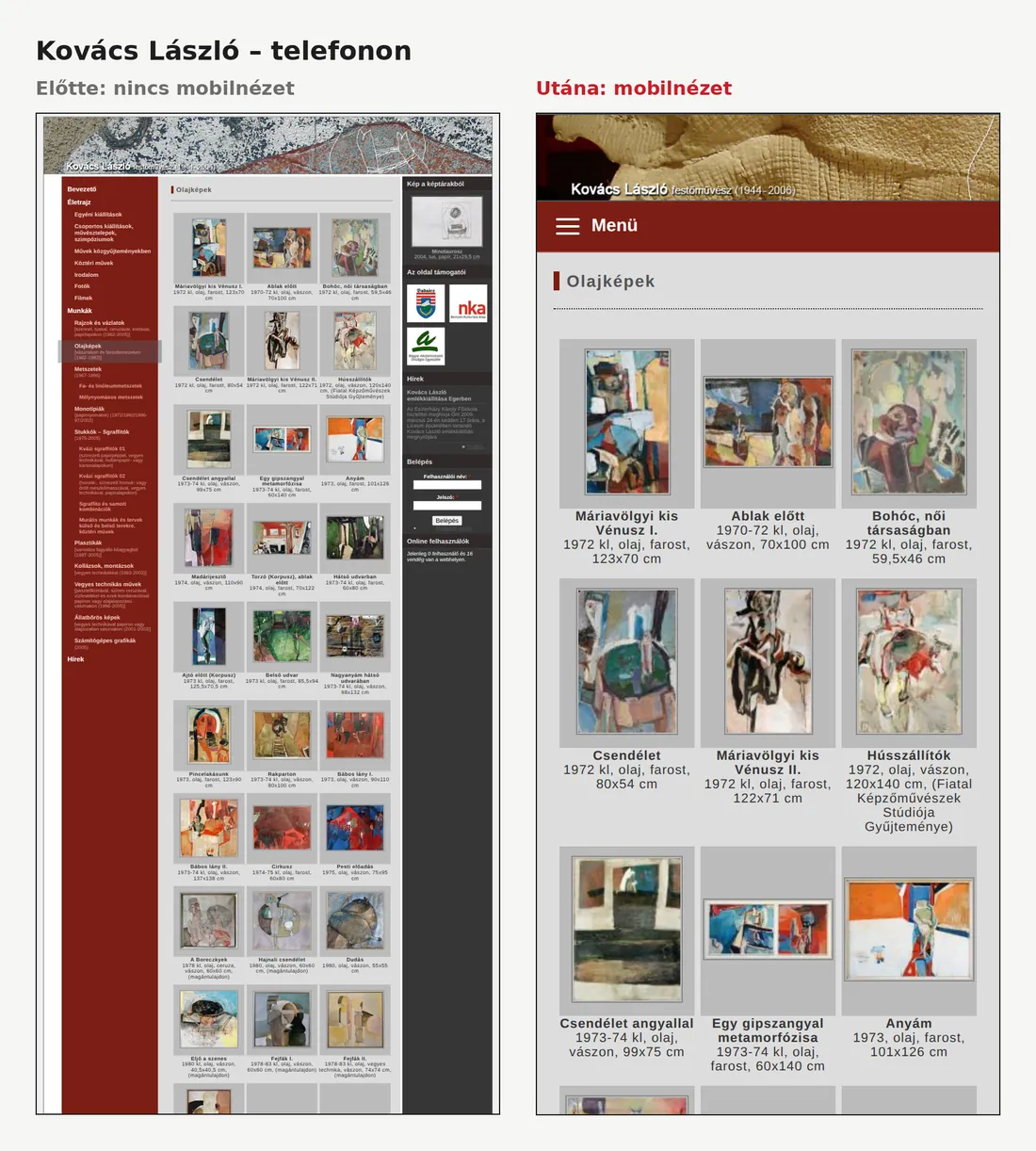
Kovács László
Shrinking the 950 px header image would make the name illegible, so phones show the left part of the image, with the “Kovács László festőművész” lettering.
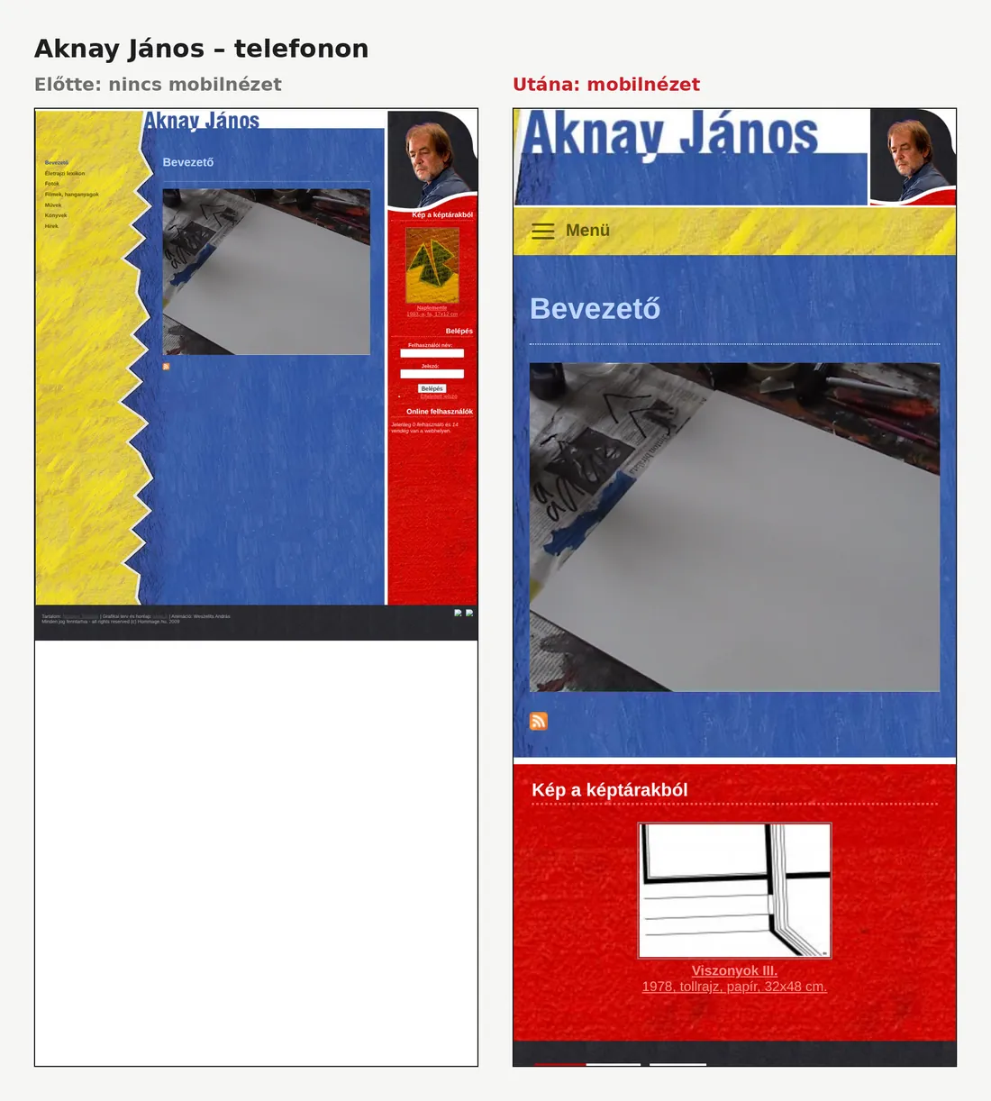
Aknay János
The zigzag edge of the yellow menu column doesn't fit a narrow screen, so a zigzag-free crop was made from the background image.
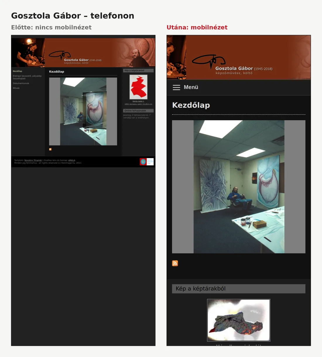
Gosztola Gábor
The header is cropped to the centre, keeping the signature and the name visible.
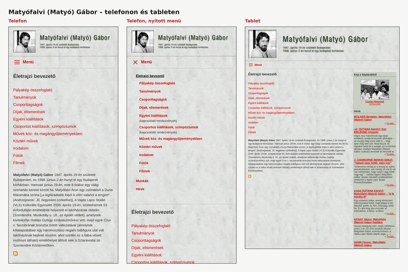
On every site
The left-hand menu becomes a drop-down “☰ Menü”, galleries keep their three-column grid with each image and its caption together, and videos fill the width.
Quality assurance
“Unchanged”: measured, not eyeballed.
Every page was automatically compared with the original site running locally.
| Check | Result |
|---|---|
| Desktop view, pixel by pixel (1280 px, full page) | 280 / 286 pages pixel-identical. The 6 differences are deliberate replacements: HTML5 player instead of Flash, a check question instead of CAPTCHA, a still image instead of the intro. |
| All visible text | 281 / 286 pages identical. The 5 differences are on those same pages: the “Get the Flash Player” text is gone. |
| Mobile (390 px) and tablet (820 px) | 0 pages overflow horizontally. |
| Internal links and files | 2 broken out of 5,923; both files were already missing from the original, and neither is visible. |
| Old addresses | All 11,314 addresses that worked in the old system lead to a live page: 4,868 to the same page, the rest to the gallery or listing page that shows their content. Only about 30 test and draft pages lead to the home page. |
| Old file addresses (images, PDFs, audio) | 3,374 of 3,383 available at the unchanged address; the 9 missing ones belonged to the old Flash players. |
So that only real differences counted, the comparison applied the documented, deliberate changes to the original as well (removing the login and “Who's online” boxes, which can't work on a static site, and writing in the new footer) and put random elements into the same state on both sides.
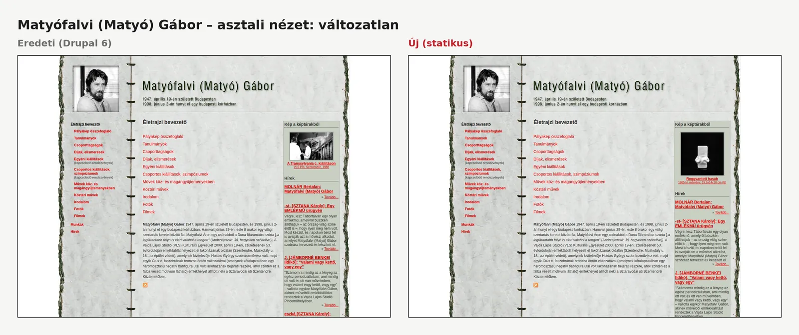
Fixed along the way
Old faults that are now gone.
- Audio and video, silent for years because of Flash, play again, on phones too.
- The Matyófalvi site's video had pointed to the wrong address even on the live site; it works now.
- The gallery lightbox slid off-centre on narrow images and its thumbnail strip overlapped; fixed.
- The favicon never showed on any site, because the file was actually a GIF named .ico; it shows everywhere now.
- The footer sponsor logos (NKA, MAOE) were empty files showing as broken images; replaced.
- Missing thumbnails and faulty e-mail links fixed; the old Google Analytics code, dead since 2023, and needless background calls removed.
Results
Before and after.
| Area | Before | After |
|---|---|---|
| System | Drupal 6, PHP 5.6 and MySQL, unsupported for years | static HTML, no database, no CMS |
| Security | outdated CMS and PHP, with a public login | no CMS to break into; one small standalone form script |
| Mobile view | none | on all 6 sites, tablet and phone |
| Desktop look | – | 280/286 pages pixel-identical, the rest deliberate fixes |
| Audio and video | not working (Flash) | HTML5, in every browser, on phones too |
| Old links | – | 11,314 old addresses kept, with 301 redirects |
| Scope | – | 286 HTML pages and 250 RSS feeds on 6 domains |
| Hosting | existing | the same: no need to switch provider |
| Maintenance | CMS, PHP and database updates that no longer even existed | practically none |
Under the hood
Tools for the rescue and the verification.
Assessment: 6 October 2026 · Live: 16 October 2026
Transparency
Our own earlier work, not a paid engagement.
Our founder built the hommage.hu sites in the late 2000s, and we did the replacement as our own project, not on commission. So this case study is not a client reference; it shows how we work with an old but valuable website. The “before” images were taken from a local copy of the original site, revived from the live database and files; the “after” images from the new static version.
Next step
Got an old website nobody dares to touch?
It doesn't have to be rebuilt from scratch to become secure and mobile-friendly. We look at what's valuable in it (the content, the design, the old links) and fix it while keeping that.